Shipping Carrier Performance: Compare Last-Mile KPIs with Real-Time Logistics Data
In e-commerce, the delivery experience is pivotal, often hinging on the performance of shipping carriers. After securing that coveted item, customers are left with anticipation that can quickly turn to frustration if the delivery process falters. But what is a shipping carrier exactly, and how does it impact customer satisfaction? They are the companies responsible for physically transporting goods, and their reliability is paramount. The stakes are high: 79% of online shoppers may not return to a brand after a single negative delivery experience. This highlights the critical nature of the post-purchase journey, as 90% of consumers consider it just as vital as the product itself. Before a customer's order even reaches their hands, understanding the nuances of shipping carrier comparisons is crucial for businesses. Missing the mark on shipping speed or failing to provide updates via real-time logistics data can have significant repercussions. Today, 61% of customers are prepared to switch to a competitor after just one poor experience. From what we've seen over the years, a seamless and reliable delivery experience, powered by the right choice among various shipping carriers, is not optional. We need it for customer retention and loyalty. Businesses that prioritize logistics. Business that ensure efficient and transparent delivery processes, will gain significant competitive advantages. This is why logistics operations teams need to dedicate their time to evaluating carriers’ last-mile delivery KPIs. However, each carrier reports data in different formats, making performance analysis tedious. Our platform resolves this problem by integrating and harmonizing logistics data across all your carrier partners. With the Carrier Performance report – available as part of the Parcel Perform post-purchase experience – you can view and dissect the harmonized real-time logistics data to uncover critical carrier metrics. From the easy-to-consume charts, you can quickly identify which carriers are not meeting delivery benchmarks.
Here’s a breakdown of the report’s 6 key charts and how you can best use them to optimize last-mile efficiencies:
Shipment Count (split by carrier)
Carrier Shipment Volume (by destination country)
Shipment Status (split by carrier)
Average Transit Time by Different Shipping Phases split by Carrier
Shipment Issues split by Carrier per Issue Type
Carrier Performance Summary
Get a view on which carriers are carrying out the bulk of your deliveries
Are you about to join a call with your carriers and have only a few minutes to spare? The Shipment Count (split by carrier) chart is exactly what you need. It gives you a clear overview of the total shipment volume for each carrier, helping you understand which carriers are responsible for the majority of your deliveries. You can also use the information to support your negotiations with carriers for better rates and to optimize your supply chain costs.
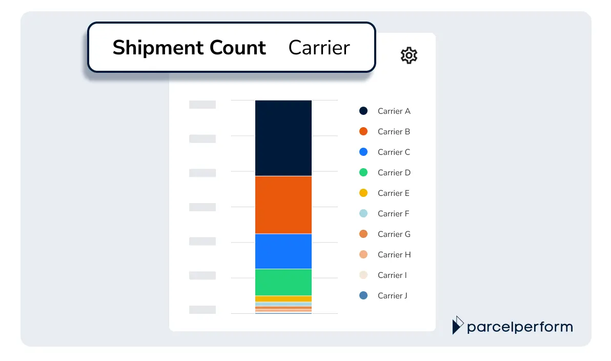
The Shipment Count (split by carrier) shows the total number of shipments each of your carrier delivers
Pro tip: Want to get an in-depth understanding of how shipment volume is distributed across different countries for each carrier? Refer to the Carrier Shipment Volume (by destination country) chart in this report.
Monitor shipment volume trends for each of your carriers across all target markets
The Carrier Shipment Volume (by destination country) chart shows us a breakdown of our carrier’s total shipment count across the countries they serve. This helps you evaluate if the shipment volumes match the planned shipment load distribution. This gives you the insights needed to restrategize your logistics approach when necessary. Here’s an example of how to use this chart: Conduct a corresponding supply chain analysis on your top 10 carriers to identify areas for cost optimization. If Carrier B delivers to Germany at a lower cost, you can consider redistributing shipment volume from Carrier A to Carrier B to reduce shipment costs.
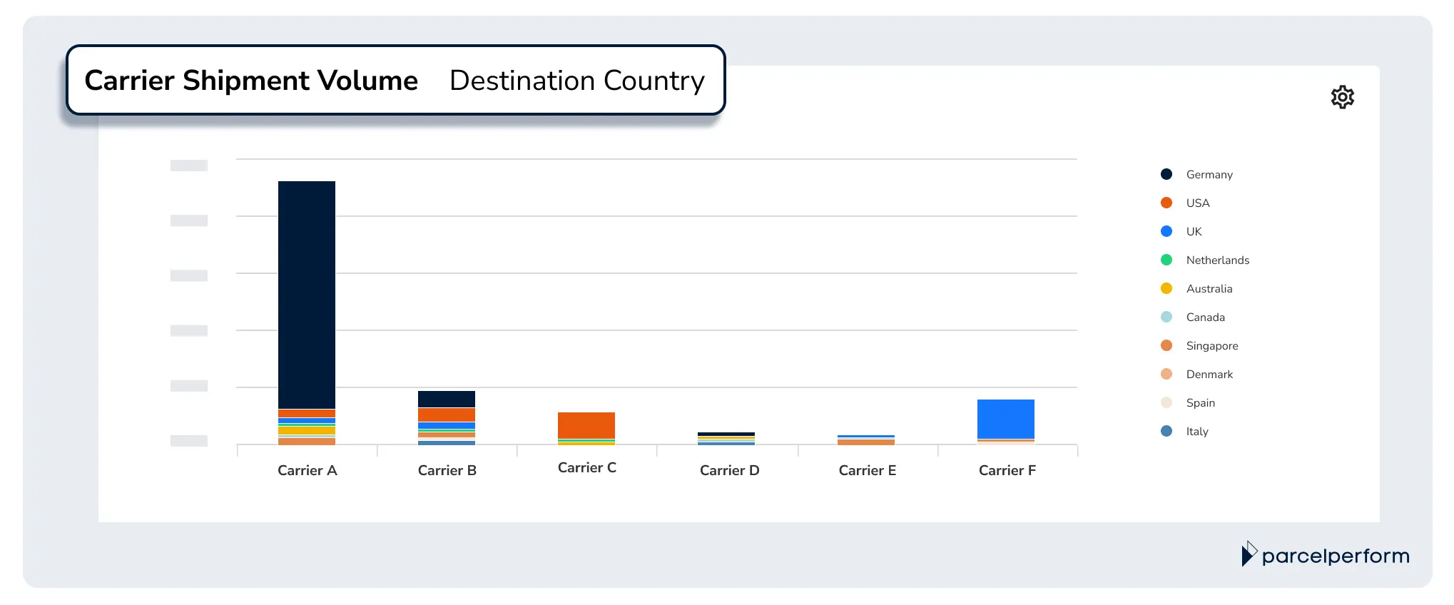
The Carrier Shipment Volume chart shows the total shipment volume of each carrier, with a breakdown of the destination countries that they are serving.
Pro tip: The chart displays all the countries your top 10 carriers deliver to. If you wish to exclude any country from the chart, simply scroll through the country list on the right side of the chart and deselect the country label.
Quick assessment of carriers’ delivery success rates with the breakdown of shipment status
Knowing the success rates of your carrier partners for every delivery gives you the necessary information to negotiate prices, prepare for peak season demand, and even refine your supply chain processes. The Shipment Status (split by carrier) chart enables that by presenting a breakdown of the current delivery statuses of your top 10 carriers. The chart not only highlights carriers with high delivery success rates but also alerts you to the carriers that frequently encounter issues like involuntary returns or other shipment bottlenecks. This allows you to take proactive steps toward finding a solution before it affects the customer's experience negatively.
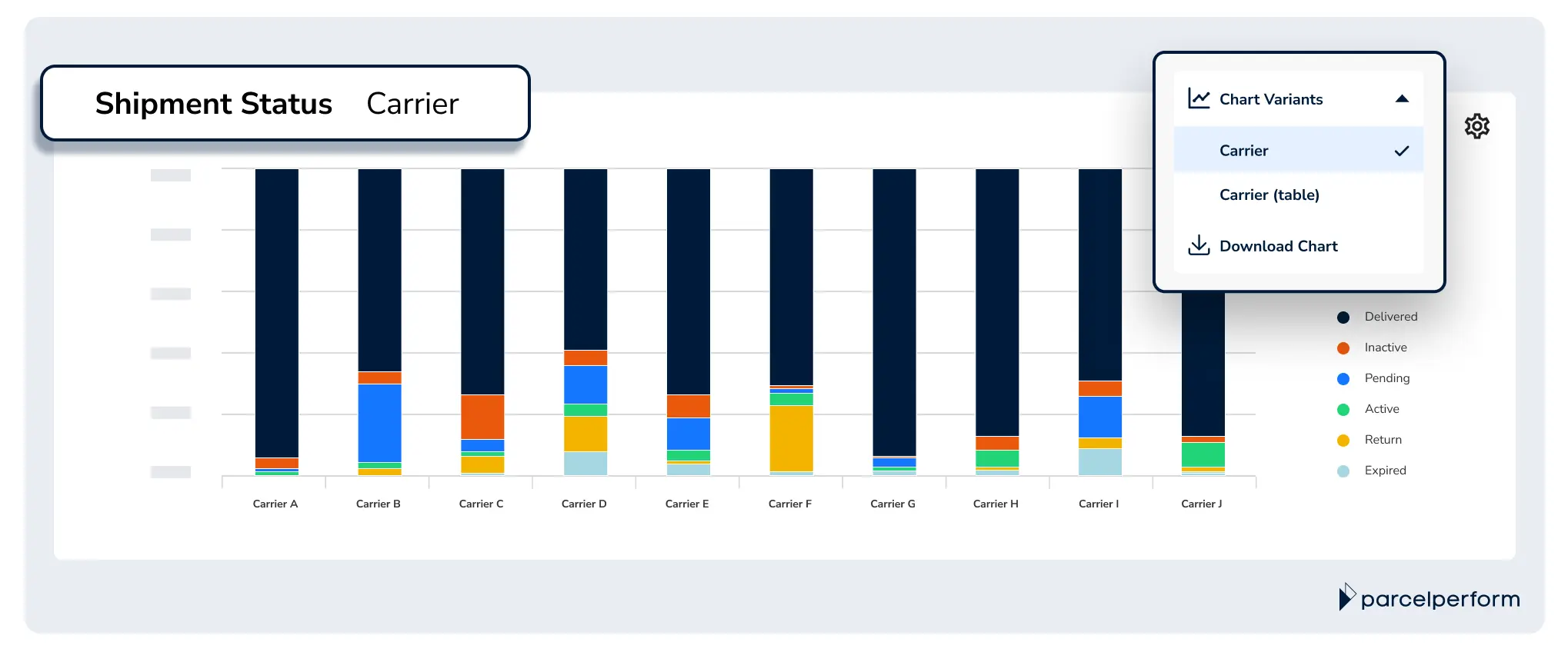
The Shipment Status chart shows the distribution of shipment statuses of the shipments that each carrier is delivering.
Pro tip: Zoom in on specific problems by cross-referencing the “Shipments with Issues per Status” chart in the Overview of Issues report.
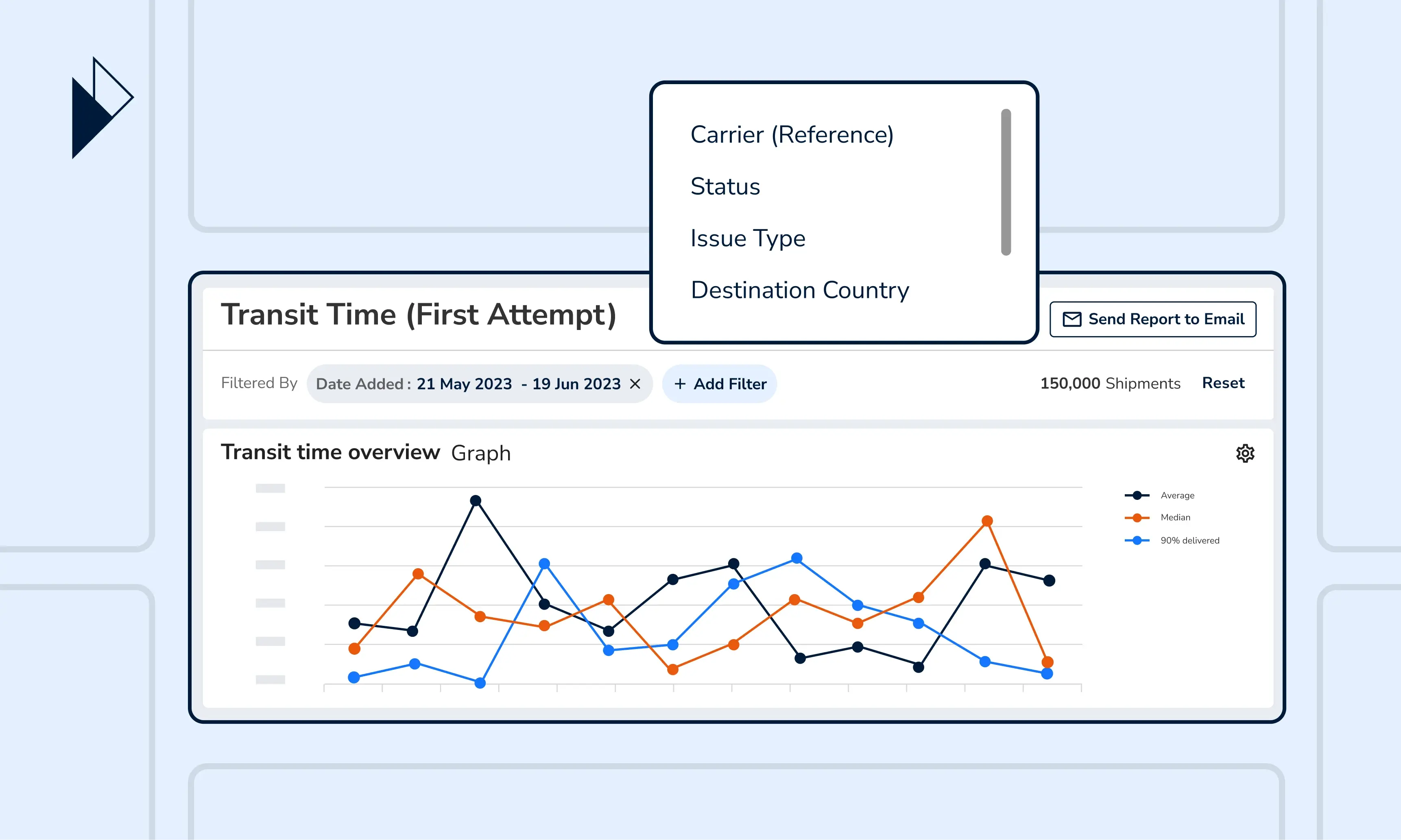
Deep dive into carriers’ last-mile delivery speed
Your customer’s delivery experience depends on how fast they can receive their orders. That makes your carriers’ speed of delivery highly crucial to your business. For those wondering what is a shipping carrier's impact on customer satisfaction, it directly relates to their ability to deliver quickly and efficiently. The “Average Transit Time by Different Shipping Phases split by Carrier” chart provides insights into how fast your carriers can deliver orders and other performance metrics. This chart helps you gauge carrier performance by measuring the average time it takes for a parcel to get from one milestone to the next–from start to finish.
The chart is available in 2 variants. The bar graph visualizes your top 10 carriers’ average shipping speed at each shipping phase. You can identify at a glance the carriers facing delivery delays, and at which phase of the journey. The corresponding table details the average transit time in each shipping phase. When toggled to view by hours, it gives a granular look into each carrier’s delivery speed and is extremely helpful when comparing the performance of same-day delivery services.
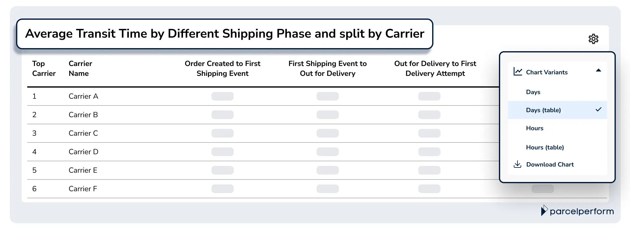
The Average Transit Time by Different Shipping Phases split by Carrier shows the average time carriers take during each different milestone, in days and hours.
Pro tip: To better understand carrier performance based on average time, cross-reference the “Transit Time Distribution, split by Carrier” chart in the Transit Time (First Attempt) Report.
Identify the source of your carrier’s delivery bottlenecks
Identifying common issues your carriers face can help formulate a best-fit issue resolution plan. The Shipment Issues split by Carrier per Issue Type chart helps by showing the percentage of shipments with issues–and pinpointing its source according to carrier, sender, merchant, warehouse, or recipient-related. The chart is available in 2 variants. With the bar graph, you can tell at a glance the main problems for each carrier and identify repeating bottlenecks across all carriers. The corresponding table shows an exhaustive breakdown of the exact shipment count with issues, helping you prioritize the ones that require immediate troubleshooting for each carrier. The corresponding table shows a detailed breakdown of the shipment count with issues. This breakdown helps you prioritize the major issues that require your immediate attention.
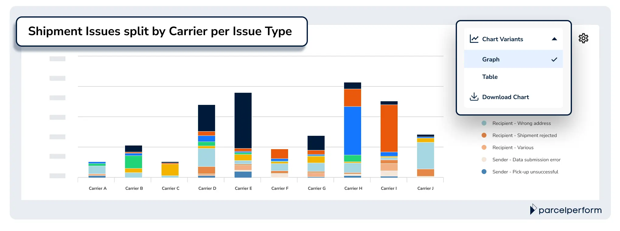
The Shipment Issues split by Carrier per Issue Type chart shows the total number of shipments with issues and breakdown by issue category.
Through Parcel Perform, shipment issues across 1,100+ carriers are consolidated into 67+ standard categories–which are reflected in all of our issues-related reports and charts. With harmonized data, there’s is no chance of overlapping data due to disparate carrier reports or labelling conventions.
Pro tip: To get a more holistic view of your shipment health and issues occurring along the last-mile delivery journey, explore our Overview of Issues report.
The cheat sheet (chart) for evaluating carrier performance for busy logistics leaders
Can’t find the time amongst all your responsibilities to keep carrier performance on track? Here’s your cheat sheet to help determine if your carrier partners are meeting the benchmarks - the Carrier Performance Summary chart. The chart consolidates the must-know KPIs across all your carrier partners.
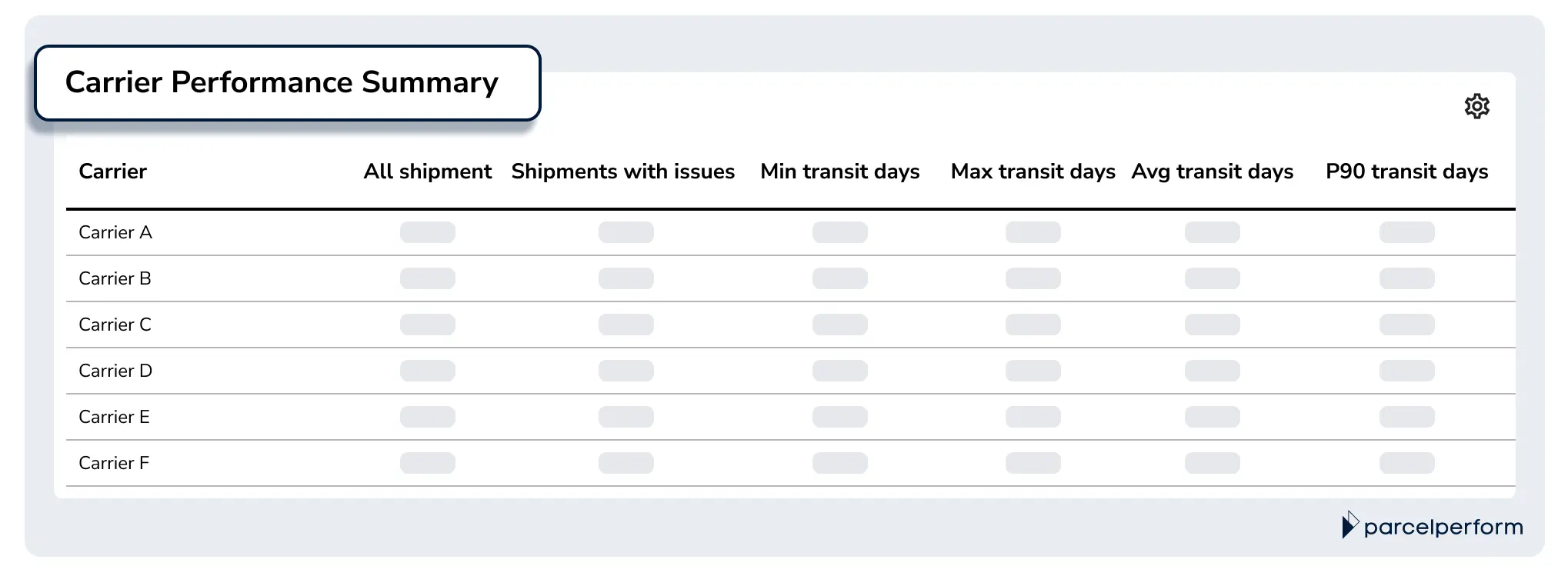
The Carrier Performance Summary chart highlights key carrier KPIs on shipment, issues, and trasit days.
Pro tip: Make this your go-to chart when comparing carriers delivering to the same country. Simply apply the report filter “Destination Country” and select the country or countries you wish to compare.
Gathering unbiased and harmonized carrier performance data is the first step to optimizing last-mile delivery experience and cost
Parcel Perform’s Carrier Performance report is designed to be a reliable source when you are monitoring carrier KPIs. This report eliminates the need to wait for individual carrier reports and the time spent consolidating disparate reports into a master report. Instead, we can use the Carrier Performance report to get direct access to near real-time, unbiased insights. This allows us to jump straight into issue resolution, cost analysis, and stakeholder reporting. Besides the default chart displays, you can apply filters and view the charts from various perspectives for a complete overview of your logistics setup. Parcel Perform also lets you capture snapshots of any chart and share them via a message, or send the entire report via email to key stakeholders. Our E-Commerce Co-Pilot also takes post-purchase business intelligence to the next level. Upgrade to an industry-tailored BI for enhanced decision-making. Get a 360° view of all your harmonized post-purchase data via bespoke dashboards.Book a demo with our e-commerce logistics experts now, and we’ll guide you through the best practices for shipment reporting. Learn how you can easily monitor and improve logistics operations from day 1 with Parcel Perform’s industry-leading data.

You might also like
Overcome these 6 barriers to maximize returns profits
The path to profitable returns is not an easy one. Here are several barriers that e-commerce businesses face.
Dec 14, 2023